Why Icons Matter in UI/UX Design
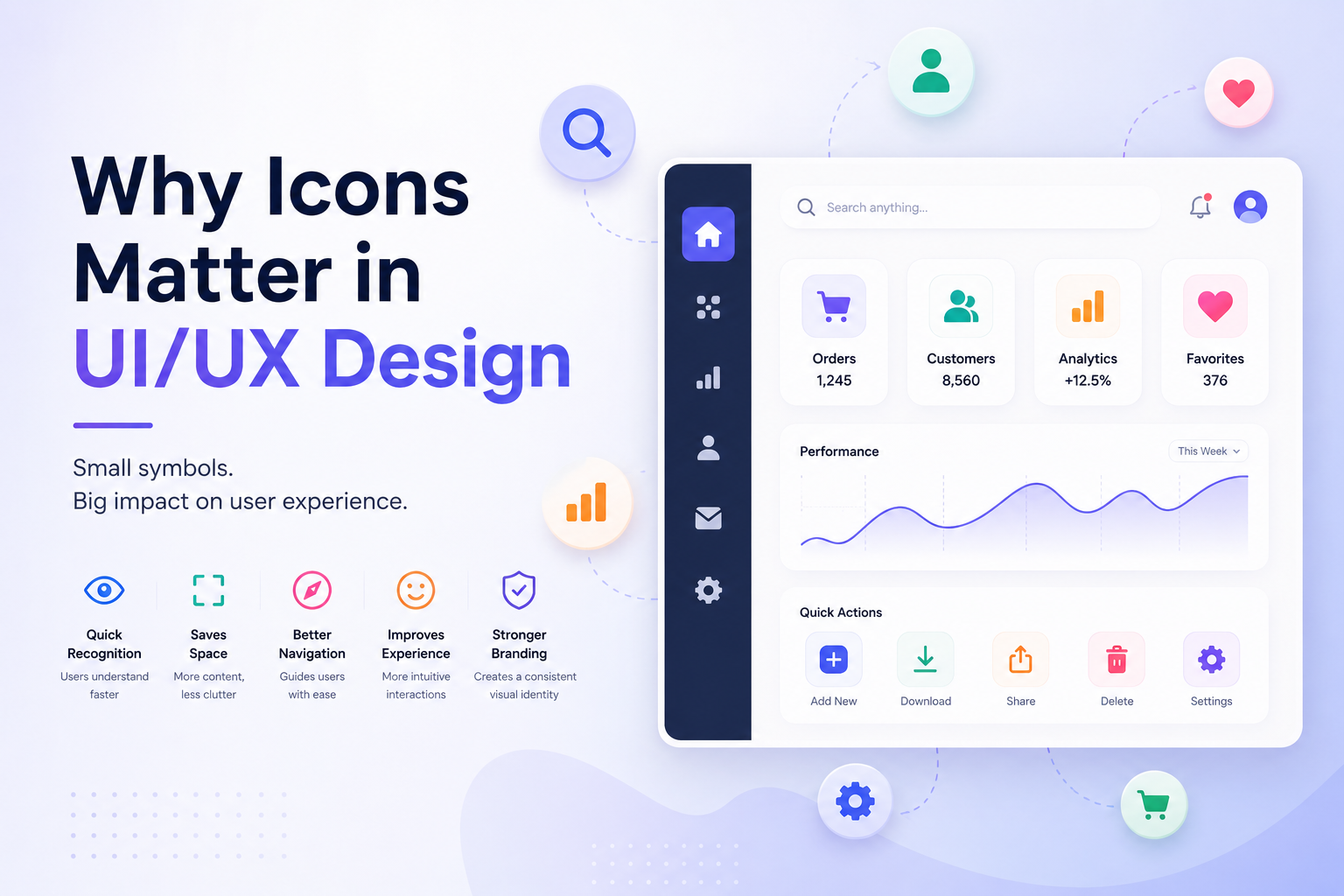
Icons are everywhere in modern digital products. From navigation menus and shopping carts to search buttons, notifications, settings, and social media actions, icons help users understand interfaces quickly and interact with them more naturally.
A well-designed icon can communicate an idea in a fraction of a second. A poorly chosen icon, however, can confuse users, increase cognitive load, and make an interface feel inconsistent.
For designers, understanding the role of icons in UI/UX design is essential for creating interfaces that are clear, intuitive, accessible, and visually consistent.
In this article, we'll explore why icons matter in UI/UX design, how they influence user experience, where to use them, common mistakes to avoid, and how to choose the right icons for a digital product.
What Are Icons in UI/UX Design?
An icon is a small visual symbol used to represent an object, action, concept, or function.
For example:
- 🔍 Search
- 🛒 Shopping cart
- ❤️ Favorite
- ⚙️ Settings
- 🏠 Home
- 🔔 Notifications
- 👤 Profile
- 🗑️ Delete
Instead of explaining every function with a sentence, designers can use familiar visual symbols to communicate meaning quickly.
Icons are particularly useful in interfaces where space is limited, such as mobile applications, dashboards, navigation bars, and responsive websites.
Why Are Icons Important in UI/UX Design?
Icons are more than decorative elements. They are an important part of the communication system of a user interface.
Here are some of the main reasons icons matter.
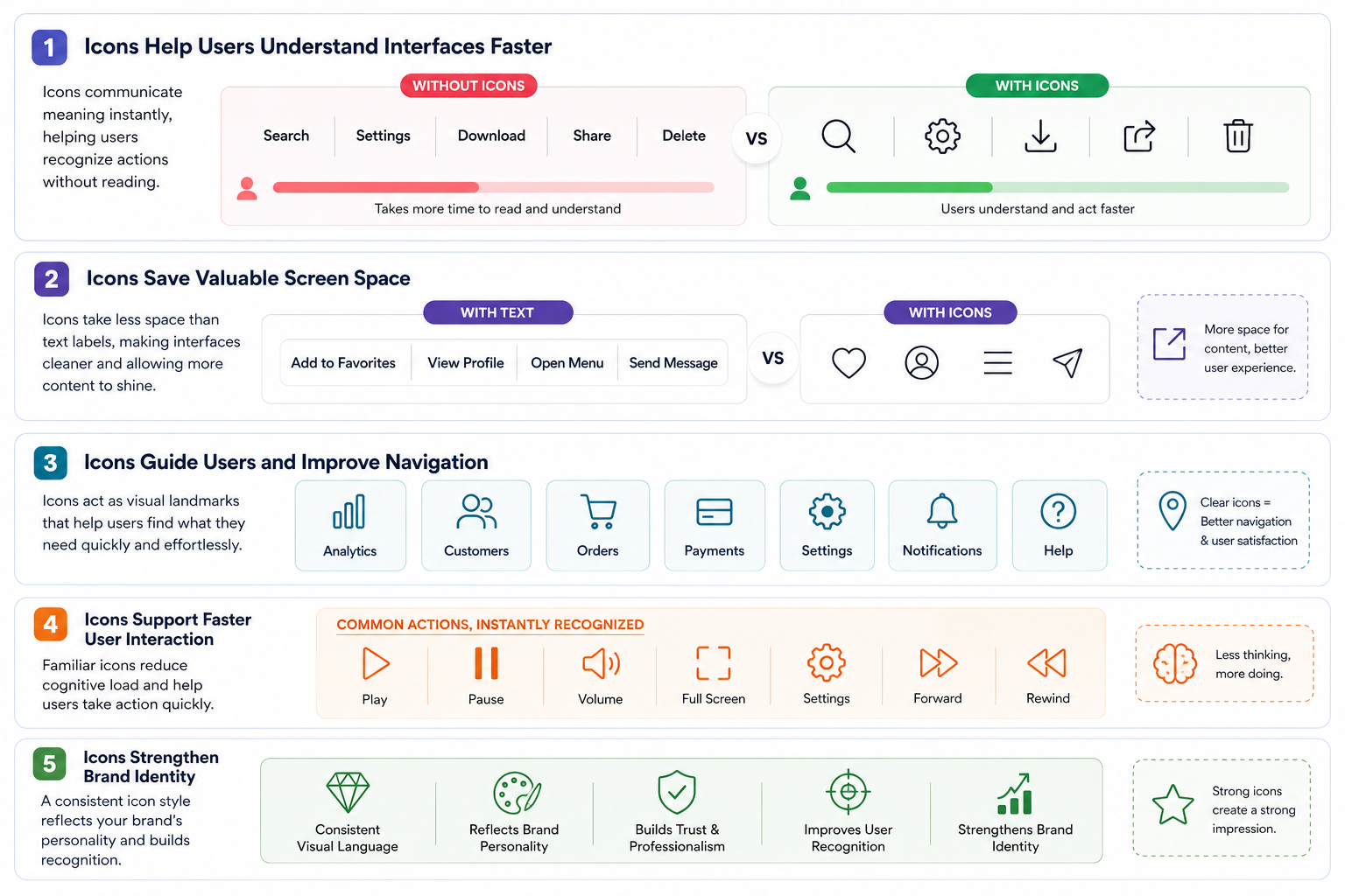
1. Icons Help Users Understand Interfaces Faster
One of the biggest advantages of icons is their ability to communicate information quickly.
When users see a familiar magnifying-glass icon, they can usually understand that it represents search without reading a label.
This reduces the amount of time users need to understand an interface.
For example, imagine a toolbar containing:
Search | Settings | Download | Share | Delete
If each function is represented by a recognizable icon, users can scan the toolbar much faster.
Good iconography supports visual scanning, helping users find actions without reading every element on the screen.
2. Icons Save Valuable Screen Space
Screen space is especially important on mobile devices.
A text label such as:
Add to Favorites
takes considerably more space than a familiar heart icon.
Similarly:
Open Navigation Menu
can often be represented by a compact menu icon.
This makes icons particularly useful for:
- Mobile applications
- Navigation bars
- Toolbars
- Dashboards
- E-commerce interfaces
- Media players
- Productivity applications
However, saving space should not come at the expense of usability.
If an icon isn't immediately recognizable, adding a text label can make the interface much clearer.
3. Icons Improve Visual Navigation
Icons help users visually navigate through an interface.
Consider a dashboard containing dozens of sections. If every section uses only text, the interface can become visually repetitive.
Adding meaningful icons creates visual landmarks.
For example:
Analytics → 📊
Customers → 👥
Orders → 🛒
Payments → 💳
Settings → ⚙️
Users can quickly associate each icon with a particular function.
This makes interfaces easier to scan and navigate.
4. Icons Create Visual Hierarchy
UI/UX designers use visual hierarchy to guide users toward important information and actions.
Icons can contribute to this hierarchy through:
- Size
- Position
- Shape
- Color
- Contrast
- Spacing
- Visual weight
For example, a large shopping-cart icon near a product purchase area can draw attention to the shopping experience.
Similarly, notification icons can help users quickly identify alerts within a dashboard.
The key is to use icons purposefully rather than adding them simply to make an interface look attractive.
5. Icons Make Interfaces More Intuitive
A good interface should not require users to learn everything from scratch.
Familiar icons take advantage of users' existing knowledge.
For example:
- A magnifying glass usually represents search.
- A trash can commonly represents delete.
- A house commonly represents home.
- A gear commonly represents settings.
- A plus sign commonly represents adding something.
- A play triangle commonly represents playing media.
Because users have encountered these symbols repeatedly, they can often understand them immediately.
This is one reason standardized iconography is so valuable in UI design.
6. Icons Support Faster User Interaction
Icons can make common actions easier to locate and activate.
Imagine a video player.
Users expect to see familiar controls such as:
- Play
- Pause
- Volume
- Full screen
- Settings
- Forward
- Rewind
Because these controls are visually recognizable, users don't need to read instructions every time they interact with the player.
Good icon design therefore helps create efficient user flows.
7. Icons Help Establish Brand Identity
Icons can also become part of a brand's visual language.
A company may develop a specific icon style using:
- Consistent stroke widths
- Specific corner radii
- Brand colors
- Unique shapes
- Consistent proportions
- Custom visual details
When these characteristics are applied consistently, icons become part of the overall design system.
For example, a financial application might use a clean, geometric icon style to communicate professionalism and reliability.
A children's application might use softer shapes and brighter colors.
The icon style should therefore support the personality of the product.
The Importance of Icon Consistency
One of the most important principles in icon design is consistency.
Imagine an application where:
- One icon uses a 2 px stroke.
- Another uses a 4 px stroke.
- One has rounded corners.
- Another has sharp corners.
- Some icons are filled.
- Others are outlined.
- Some icons use a completely different visual style.
The interface may feel unprofessional even if every individual icon looks good.
Consistency creates visual harmony.
A consistent icon set should consider:
Stroke Width: Icons should generally use consistent stroke weights when they belong to the same system.
Corner Radius: Rounded and sharp corners should not be mixed randomly.
Size: Icons should follow a consistent sizing system.
Proportions: Icons should maintain a similar visual balance.
Color: Colors should follow the product's design system.
Style: Mixing unrelated styles can make an interface feel inconsistent.
Different Icon Styles in UI Design
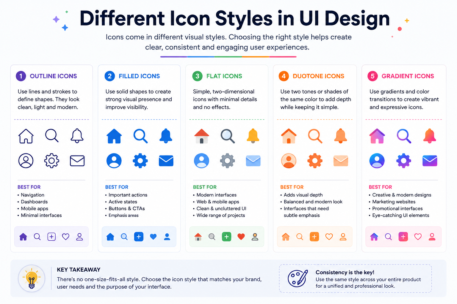
There isn't one universal icon style.
Different products may require different approaches.
1: Outline Icons
Outline icons use strokes to define shapes.
They are commonly used in:
- Navigation
- Dashboards
- Mobile applications
- Modern websites
They often provide a lightweight and clean appearance.
2: Filled Icons
Filled icons use solid shapes.
They can provide stronger visual presence and may work particularly well for:
- Active navigation states
- Buttons
- Notifications
- Important actions
3: Flat Icons
Flat icons use simple shapes and minimal visual effects.
They are popular because they are:
- Clean
- Easy to understand
- Scalable
- Suitable for modern interfaces
4: Duotone Icons
Duotone icons use two visual tones to create additional depth and distinction.
They can add personality while maintaining a relatively clean interface.
5: Gradient Icons
Gradient icons introduce color transitions and can create a more expressive visual style.
They may be appropriate for:
- Marketing websites
- Creative applications
- Promotional interfaces
- Modern product experiences
The most important factor isn't choosing the "best" style. It's choosing a style that fits the product and using it consistently.
Where Should You Use Icons?
Icons can be useful across almost every type of digital interface.
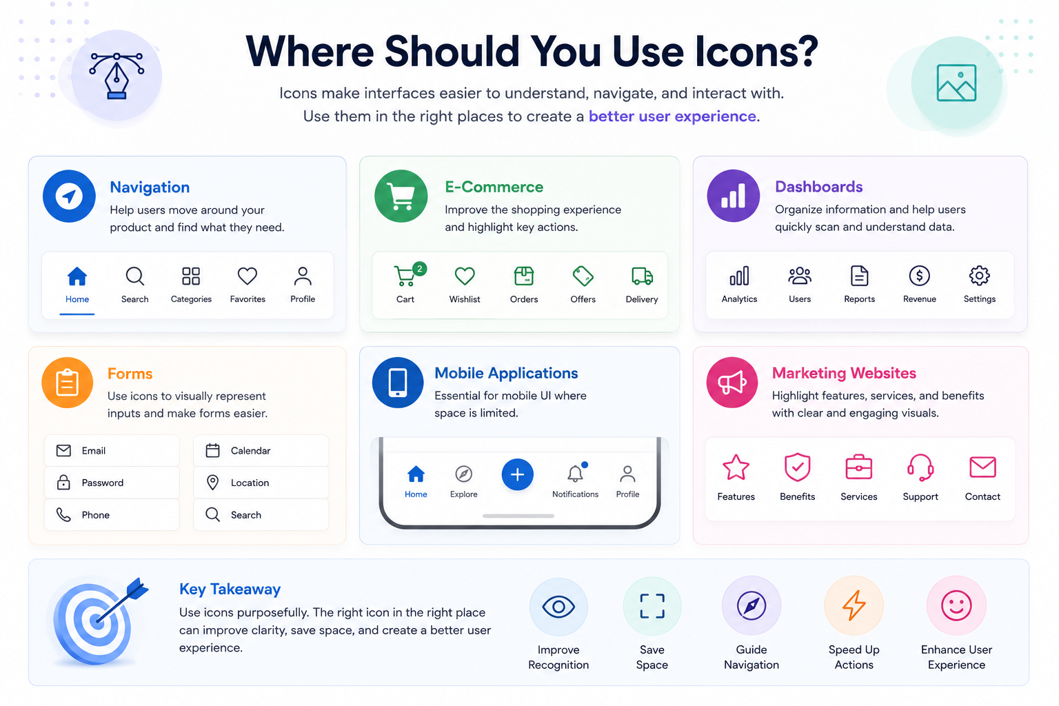
Navigation
Use icons to help users identify:
- Home
- Search
- Categories
- Profile
- Settings
E-Commerce
Icons can represent:
- Shopping cart
- Wishlist
- Payment
- Delivery
- Discounts
- Orders
- Products
Dashboards
Icons can help organize:
- Analytics
- Reports
- Users
- Revenue
- Notifications
- Settings
Forms
Icons can visually support:
- Password
- Location
- Calendar
- Phone
- Search
Mobile Applications
Icons are especially useful for:
- Bottom navigation
- Toolbars
- Action buttons
- Media controls
- Status indicators
Marketing Websites
Icons can be used to highlight:
- Features
- Benefits
- Services
- Product capabilities
- Statistics
Final Thoughts
Icons are a small part of a user interface, but their impact can be significant.
They help users:
- Understand interfaces faster
- Navigate digital products
- Recognize actions
- Save screen space
- Scan information
- Interact more efficiently
- Build familiarity with a product
However, effective iconography isn't simply about finding attractive symbols.
Good UI/UX icons need to be clear, consistent, recognizable, accessible, scalable, and appropriate for the context in which they are used.
Whether you're designing a website, mobile application, SaaS dashboard, e-commerce store, or design system, thoughtful iconography can make the experience more intuitive and professional.
The best icons don't demand attention—they make the interface easier to understand.
For designers and developers looking for ready-to-use icon resources, explore the collections available on What An Icon and find icons that fit your next project.